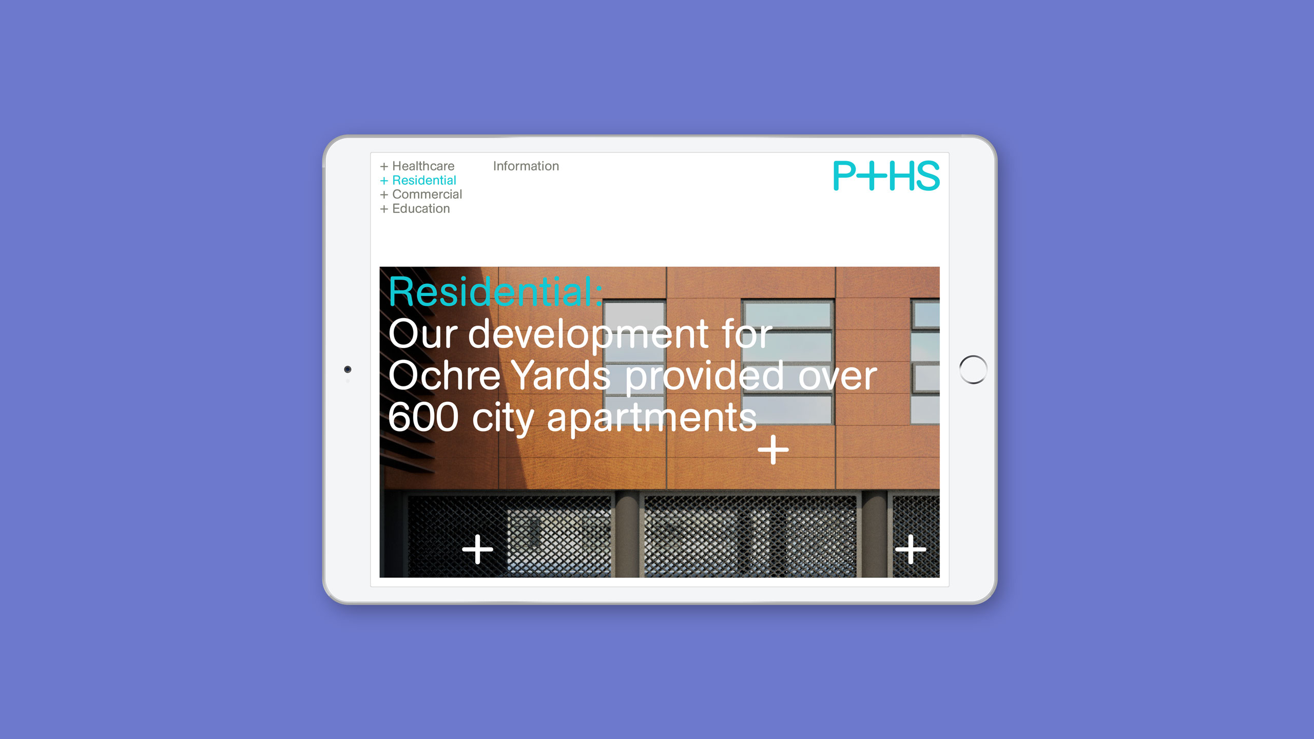
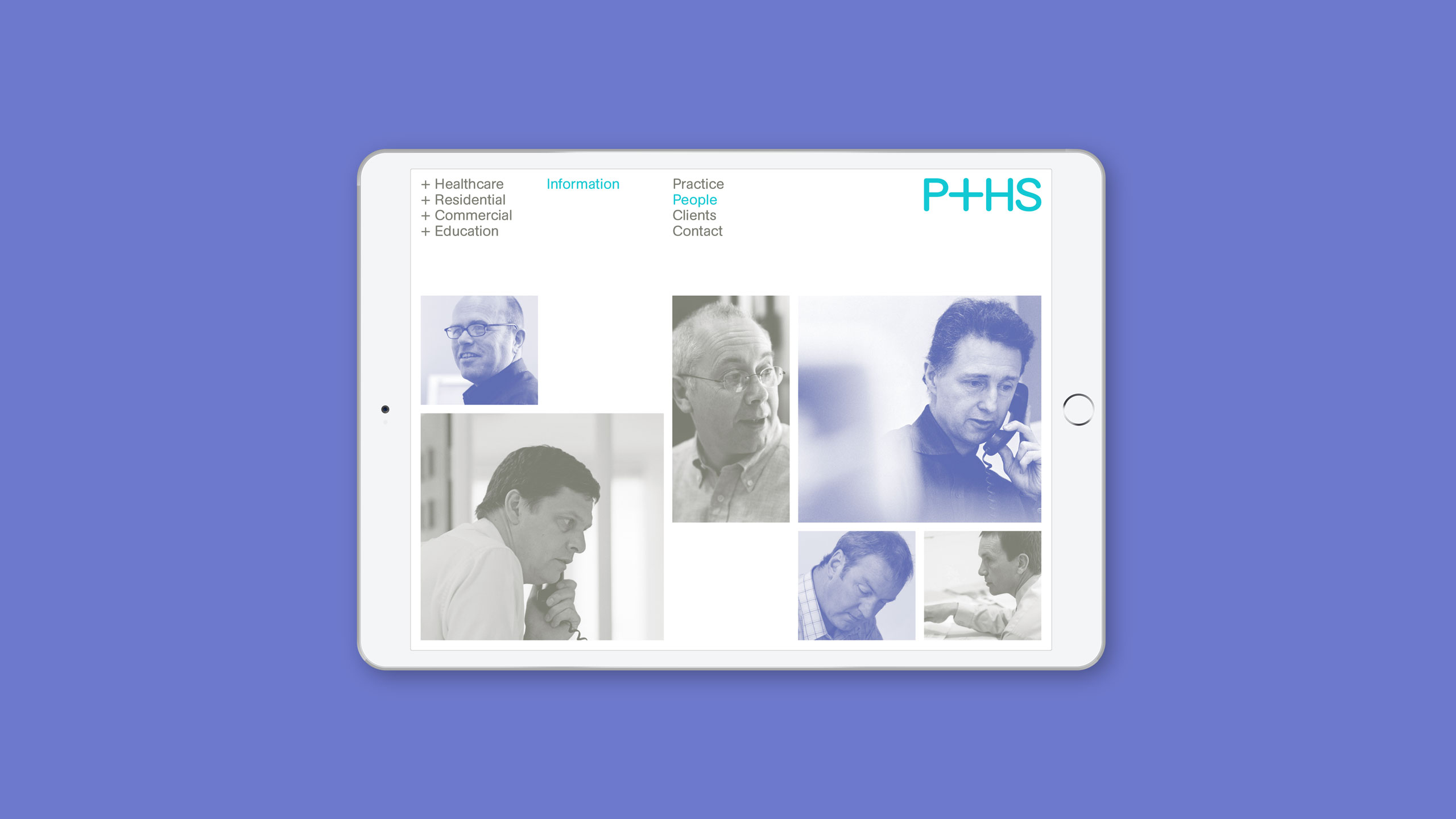
Brand identity for a leading AJ100 architectural practice.
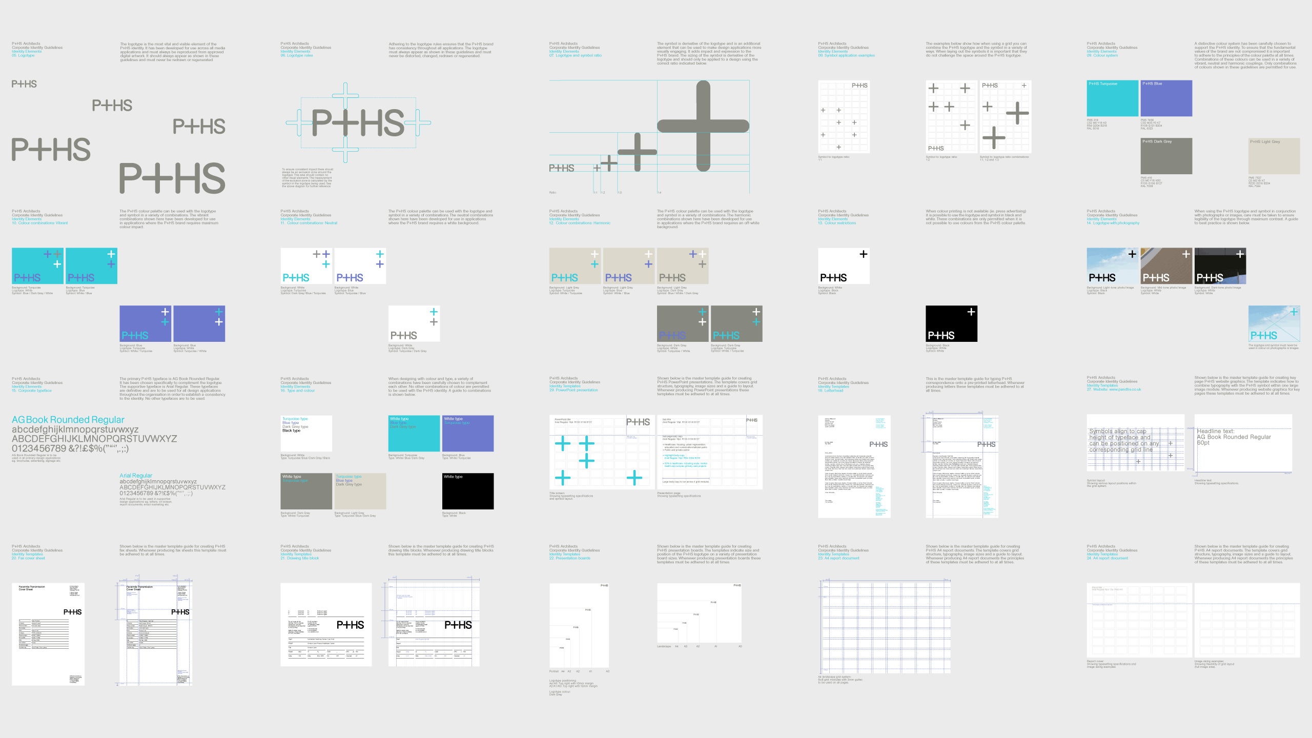
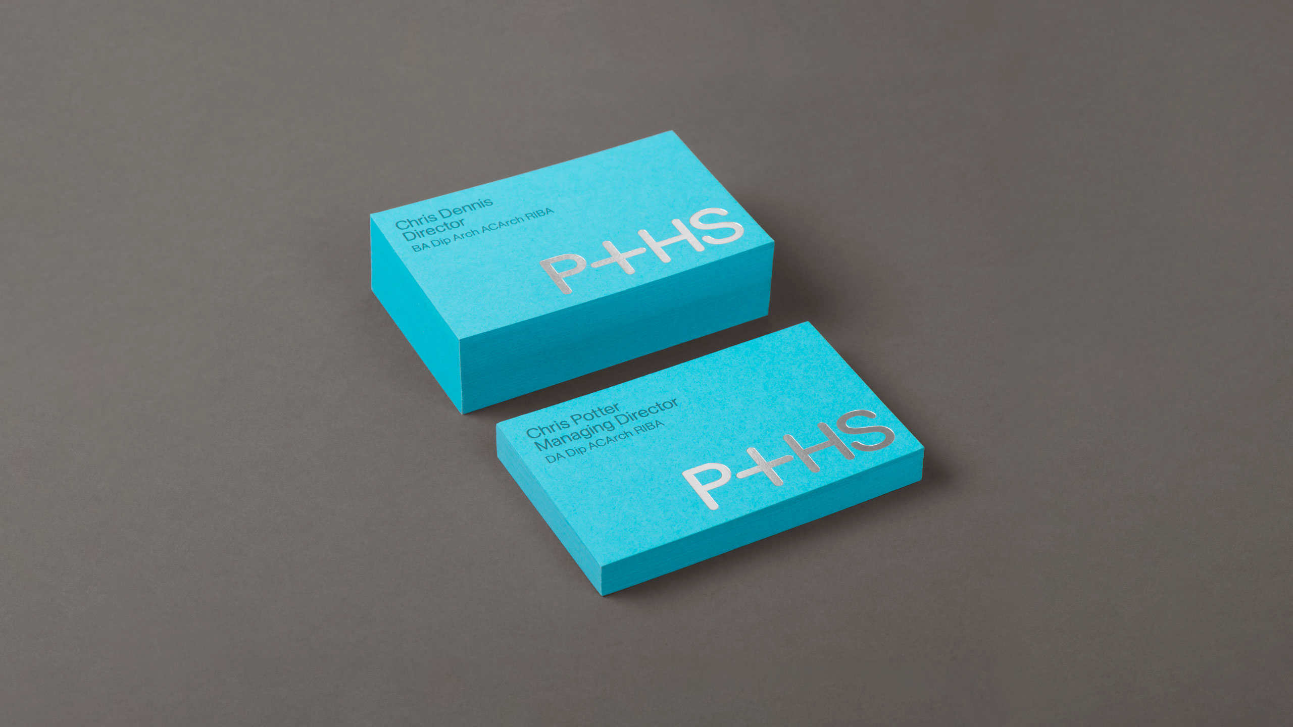
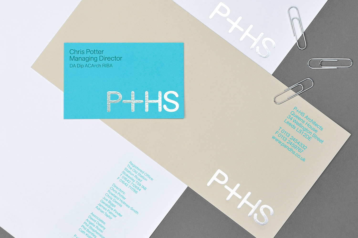
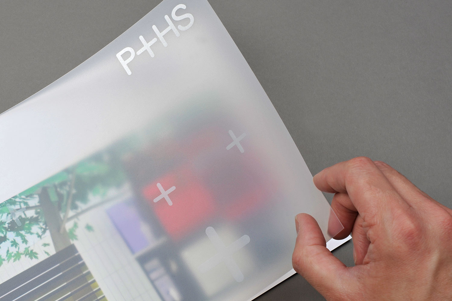
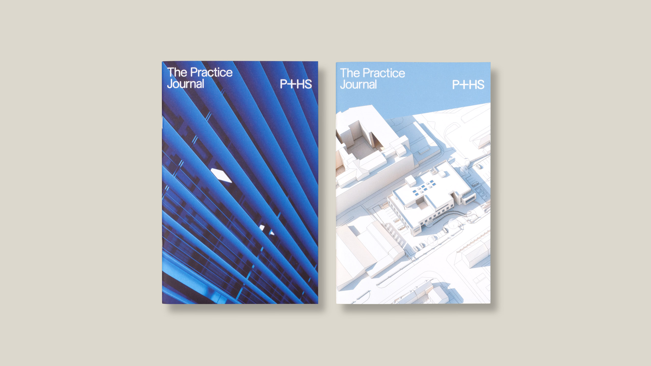
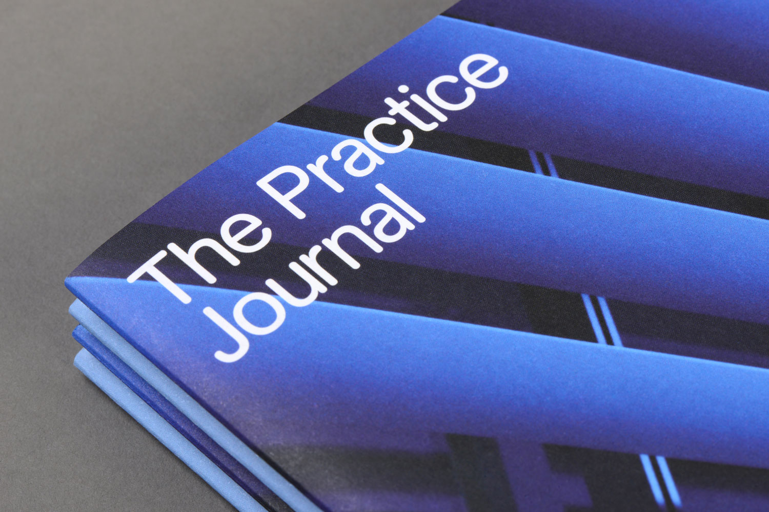
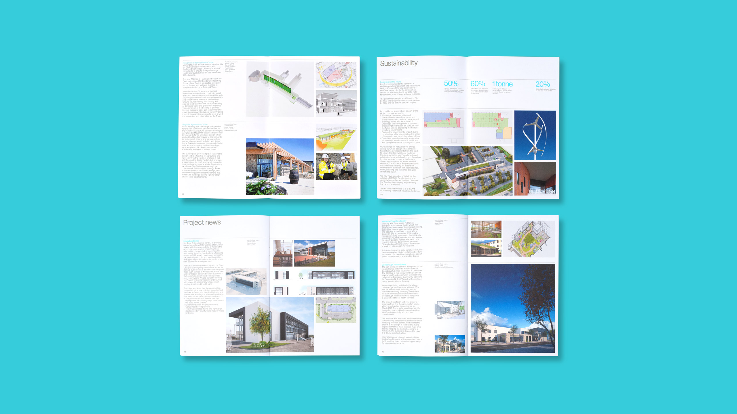
Our design strategy for P+HS Architects identity highlights the ‘+’ symbol in their name and places it at the heart of their brand. The symbol is a dynamic, storytelling device that articulates the scope and services of this established UK top 100 practice. We created extensive guidelines to control the identity and maintain brand integrity across the business. To build ongoing client dialogue we developed ‘The Practice Journal’, a publication series that showcases development of their projects from concept to construction.
CLIENT:
P+HS Architects
SCOPE:
- Brand strategy
- Brand identity
- Brand guidelines
- Print design
- Website design
- Website development


